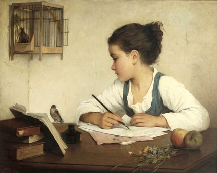
Some of you may have noticed I’ve been playing around with my header and trying out a few different ones lately. I even won a few which were nice but nothing seemed to fit right, know what I mean. Of all the ones I tried this is the one I liked the best, what do you think? It has elements that I can relate to such as writing, which is what blogging is. Books are a passion and they are prominently displayed so that was a big plus for me. There is a small bird that may be a robin in it, don’t laugh I heard that snicker. It could so be a robin, there’s red on it. There is also this overall feeling of a Jane Austin novel about it and yes I like Jane Austin. I’m very happy with this one so you will be seeing it from now on unless of course someone designs the perfect header to represent passions and soapboxes out of the kindness of their heart (just kidding). As you can see below the whole picture wouldn’t fit (I wish) so I have cropped the picture in such a way that the girl is anonymous and can represent all writers. I don’t recognize the painting and I can’t seem to relocate the original image, but if you do let me know so I can credit the artist.


I love it!
And if you half-close your eyes and make them all squinty that bird TOTALLY looks like a robin :)
Me likey!!!!!
I really like it. In fact, when I first saw it I hoped it was a keeper, meant to say something and then got lost in one of your posts. I think it’s perfect!
What a beautiful painting! I think it suits you perfectly.
I love it! It’s absolutely perfect! I vote keep it.
Love it especially with the gold damask background you have right now. The blog is looking very Jane Austeny. (Yes I make up my own adjectives)
Love it, R! Looks very elegant. :)
I like this new look of your blog. Very classy.
Love it, love it, love it…your new blog look and header totally rocks :)
I likey!
It’s beautiful.
nice one for sure.. I am a web designer, come view my fundoo blog.